Why the Eye Prefers Them and the Mind Responds to Them
The popularity of certain color palettes in interior design isn’t coincidental—it’s the result of
their alignment with human spatial perception. Visual perception studies indicate the eye
favors color systems providing clarity and harmony without strain, which these famous
palettes achieve.
First: Warm Neutral Palette
Based on beige, creamy, and sandy shades, this palette creates enclosure and comfort
feelings. It’s widely used in homes aiming for stability and calm. Research shows these
shades help the brain relax because they’re close to natural colors.
Second: White with Gray
One of the most common systems in modern designs, this palette enhances order and
clarity feelings, giving spaces contemporary character. However, studies warn against
excess without warm textures or lighting, as it may lead to emotional coldness.
Third: Blue Shades with Wood Accents
This combination blends blue’s psychological calming with natural materials’ security
feeling. Biophilic design research confirms this palette type reduces stress and increases
place connection.
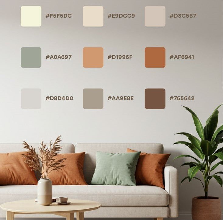
Fourth: Earthy Colors
Like brown, terracotta, and olive green, these colors enhance stability and depth feelings.
Used in spaces aiming for warm, natural atmosphere, studies indicate they reduce mental
fatigue because they’re visually familiar to humans since ancient times.
Fifth: Soft Contrast
Where a bold color mixes with neutrals in controlled proportions, this approach relies on
visual balance theory. It confirms one focal point enriches the scene without confusing the
eye when color ratios are managed.
Choosing the right palette isn’t about following fashion, but understanding why certain color
systems work better on feeling and perception levels.