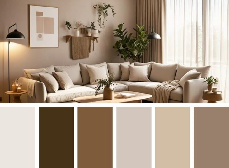
Visual Balance Between Energy and Calm
Blending warm and cool colors is one of the biggest challenges in interior design, yet also
one of the most effective ways to give space depth and vitality. Perception studies indicate
the brain constantly seeks balance between stimulation and comfort, achieved through
smart mixing of these two spectrums.
Warm colors tend to advance visually—appearing closer to the eye—while cool colors
recede. This optical effect is used in design to modify spatial perception. For example,
using a warm color on a far wall makes it appear closer, while cool colors expand space
sensation.
However, random blending of warm and cool can create visual conflict. Therefore, modern
design schools rely on “color anchoring”—choosing a dominant base color controlling the
space, then using its opposite as supporting element in smaller proportions.
Lighting plays a decisive role in this blending. Warm light enhances color warmth and
softens contrast harshness, while white or neutral light may highlight color differences more
clearly. Studies show poor lighting choice can ruin an entire palette, even if theoretically
balanced.
Materials also help achieve this balance. Pairing cool colors with natural textures like wood
or warm fabrics softens their edge and makes them more welcoming. This principle is
widely used in Scandinavian and contemporary designs.
Blending warm and cool colors isn’t about creating opposition, but visual dialogue. When
done consciously, the space transforms into a balanced environment combining energy and
calm, supporting inhabitants’ psychological state long-term.