How Color Tricks the Eye and Changes Our Size Perception
Our sense of space spaciousness or confinement doesn’t depend just on actual
area, but how the eye and brain interpret spatial boundaries. Visual perception
studies show color plays a fundamental role in this process, affecting depth and
distance reading.
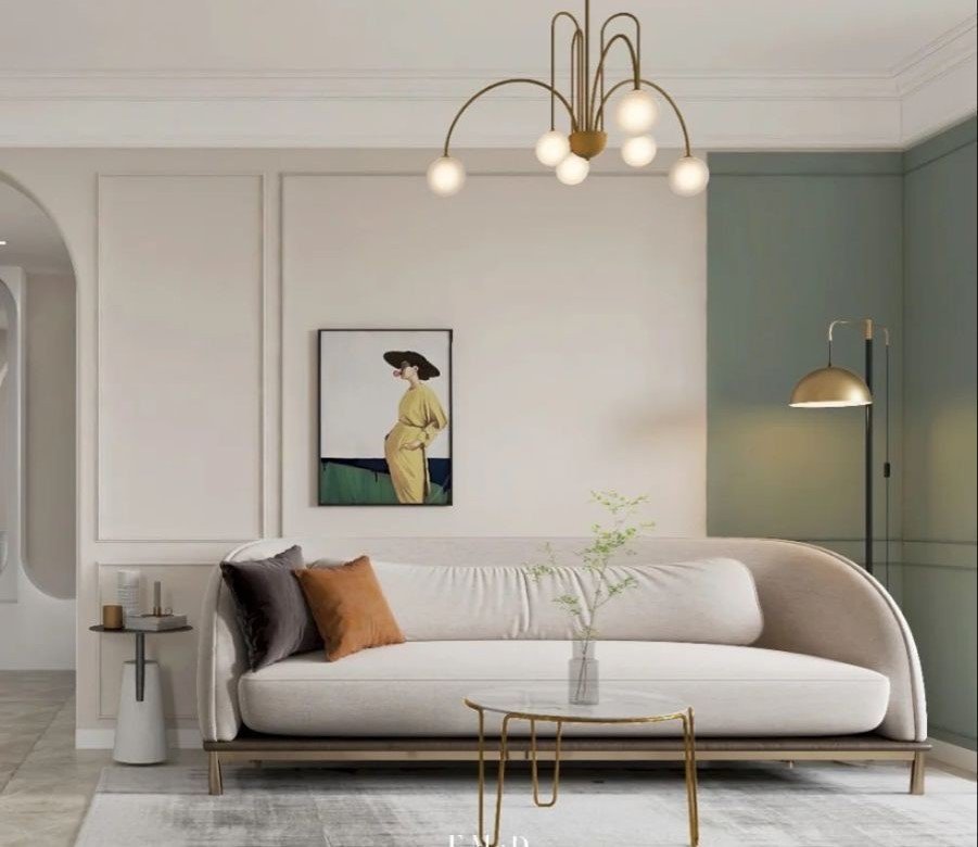
Light colors, especially low-saturation ones, reflect more light, making walls appear
farther than they actually are. This light reflection reduces boundary clarity, so the
brain perceives the space as open. That’s why these colors are widely used in small
apartments and narrow hallways.
However, not all light colors expand space the same way. Warm-leaning white
creates different feeling than cool white. Studies indicate warm light shades make
spaces more welcoming, while cool shades expand visually but may create
stagnation if not balanced with other elements.
Even ceilings play a role in this optical illusion. Using lighter color than walls makes
the ceiling appear higher, while dark or similar colors may reduce height perception.
This principle has been used in architecture for centuries to adjust spatial
proportions.
Color continuity also helps expand space. When wall and floor colors match, visual
interruptions decrease, so the brain reads the space as one larger unit. Studies
show excessive contrast in small spaces increases crowding sensation.
Visually expanding space doesn’t mean eliminating personality or color, but using
color intelligently to serve visual perception and enhance psychological comfort.