How to Create Visual Harmony Supporting Psychological
Comfort Without Eye Confusion?

Choosing three colors for one room ranks among most impactful interior design
decisions—not just aesthetically, but psychologically and perceptually too. Visual perception
studies indicate human brains prefer limited color compositions, as color abundance raises
cognitive load causing visual confusion even if colors beautiful individually.
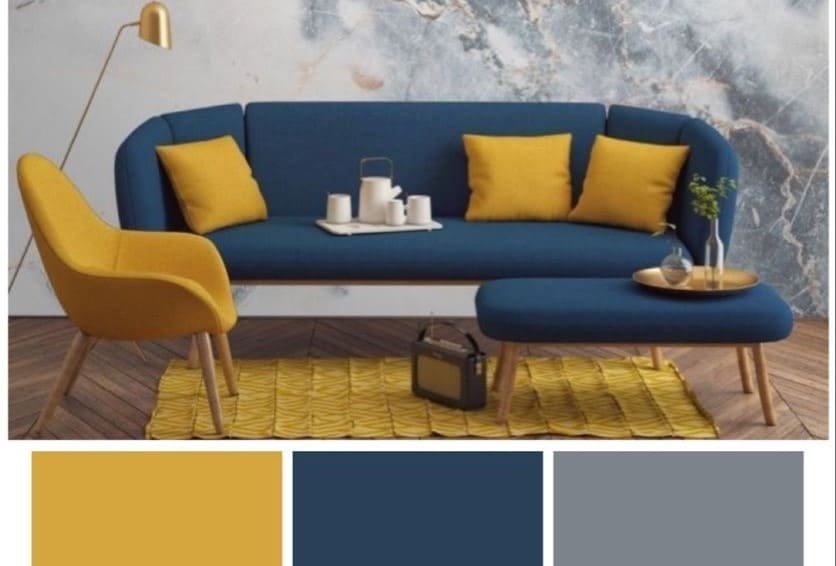
The three-color idea isn’t random rule, but stems from brain’s visual scene processing.
Research shows eyes comfortably interact with three primary color elements: dominant
base color, supporting color, and third accent color. This balance gives space clarity and
depth simultaneously.
The base color forms room’s psychological backdrop. Covering largest area like walls or
floors, it directly affects overall mood. Color psychology studies confirm this color must
prove comfortable long-term, as brains expose to it for hours daily. Thus, calm medium
shades get preferred.
Second color serves support role. Its function breaks monotony without creating visual
conflict. Appearing in large furniture or curtains, it guides eyes through space. Research
indicates supporting color must harmonize with base color, not compete with it.
Third color acts as distinction or bold touch. Used cautiously in accessories or small details
like cushions or decor pieces, visual perception science explains it works as focal point,
giving space personality and identity without dominating.
Common mistake chooses three equally strong colors. Studies confirm visual strength
gradation proves essential for eye comfort. When three colors match closely in intensity,
brains lose ability to visually organize the scene.
Lighting plays pivotal role in this composition’s success. Same color may appear completely
different by lighting type. Applied research thus emphasizes testing colors in room’s actual
lighting conditions, not relying on small samples.
Relationship between three colors must prove psychological before aesthetic. Some
compositions create calm feeling, others energy and vitality. Behavioral studies confirm
suitable composition choice depends on room function and user lifestyle.
Even materials affect color perception. Same color on glossy versus matte surface differs.
Brains respond to reflection and texture as much as color itself, thus rooms must get
viewed as integrated units.
Ultimately, successful three-color selection isn’t just artistic skill, but understanding human
vision. When color decisions build on this understanding, rooms transform into balanced
spaces providing comfort without feeling over-designed effort.