Why Do People Spend So Much and Still Regret It?
‘How can the room end up looking like this when I bought the best furniture
and the most beautiful colors?’ This sad question is asked by thousands of
people every year after spending large budgets on furnishing their homes, only
to sit in a result that neither satisfies nor comforts them. The painful irony is
that the problem usually isn’t in the quality of what they bought — it’s in the
way they placed it.
According to a study by Houzz, the interior design platform, more than 70% of
homeowners feel regret about their furniture or color choices after just one
year of living in the home. This means they’ll spend again, exhaust themselves
again, trying to fix something that could have been avoided from the beginning
by knowing a few basic rules.
In this article we’re not talking about personal taste, which differs from person
to person. We’re talking about objective rules built on visual perception
science, environmental psychology, and the experience of thousands of
designers — rules that, if followed, will make your room appear wider, more
comfortable, and more beautiful regardless of your budget.
Part One: What You Should Never Do
Mistake One: Cramming Furniture into One Corner
When people want to save space in a room, they instinctively push every piece
of furniture toward the wall. The logic seems sound: if we squeeze all the
furniture onto the edges, the central space will remain empty and the room will
look wider. But this logic produces exactly the opposite of the desired result.
Interior designers explain this through the concept of ‘visual pathways’: when
you enter any space, your eyes begin drawing imaginary lines through which
they move to explore the area. When furniture is pressed against the walls
these pathways disappear, and the eye hits a wall of furniture and interprets
the space as closed and cramped — even if it’s actually wide. The solution is
to place furniture in cohesive, close-together groupings in the middle of the
room or in specific areas, leaving a small gap between it and the walls of at
least 5 to 15 centimeters.
Mistake Two: Choosing Dark Colors for All the Walls
Dark colors are beautiful and modern when used correctly. But when they
cover all a room’s walls they absorb light and make the eye feel surrounded by
heavy surfaces closing in on it. Visual perception research has proven that
dark colors on walls can reduce the visual sense of space by up to 20%
compared to light colors.
This doesn’t mean avoiding dark colors entirely. It means using them
intelligently: just one wall as an accent wall gets the dark color while the other
walls remain light — or using dark colors in details like pillows, curtains, and
accessories. This gives you the depth and elegance you want without the
feeling of confinement.
Mistake Three: Neglecting Natural Light
Natural light is the most valuable and impactful element in any home. Many
people spend lavishly on furniture and colors then install heavy curtains that
block natural light for reasons of privacy or local aesthetic preferences. The
result is an expensive room that looks dark and heavy.
Natural light makes all colors appear at their most beautiful, gives the room a
feeling of vitality and freshness, and expands the sense of space in a way no
artificial lamp can replicate. The solution is choosing transparent or semi-
transparent curtains that allow light through while providing an acceptable
degree of privacy. A heavy curtain can be added alongside them, used only
when full privacy is needed.
Mistake Four: Filling Every Empty Space
The urge to fill every empty corner and every bare wall is one of the most
common mistakes. Many people feel that emptiness means incompleteness or
inadequacy. But professional designers know that empty space isn’t a
deficiency — it’s an active design element that rests the eye, gives what
surrounds it greater visual value, and allows the room to breathe.
The golden rule: keep at least 30% of every surface and every wall completely
free of elements. This planned emptiness is what separates a room that looks
considered and professional from one where everything appears random and
crowded.
Part Two: What You Should Always Do
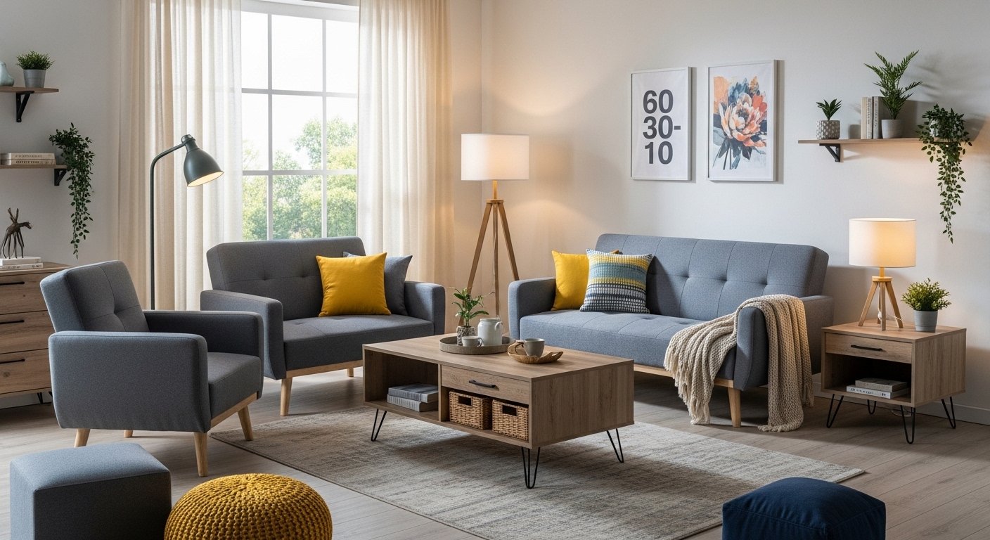
Tip One: Use the 60-30-10 Color Formula
This formula is one of the most practical tools designers use. The idea is
simple: choose a light primary color that covers 60% of the room — usually
the walls and large furniture. Then choose a secondary, bolder color making
up 30% — usually curtains or one distinctive furniture piece. Then choose a
complementary, bold accent color occupying just 10% — in pillows,
accessories, and small details.
This formula creates a visual balance that the brain finds restful and
harmonious without becoming boring. Apply it and you won’t need deep design
expertise to achieve a beautiful, coordinated result.
Tip Two: Multi-Function Furniture
In today’s world, multi-function furniture has become a necessity, not a luxury.
A coffee table with a storage drawer eliminates the need for an additional
storage unit and keeps the space organized. A sofa that opens as a bed
accommodates guests without a separate room. Wall shelves perform the
function of bulky floor storage units without taking any floor space.
According to a study published in Interior Design Trends magazine, 60% of
small-home owners who used smart multi-function furniture reported a
noticeable improvement in their daily experience and a greater sense of
comfort and organization within their homes.
Tip Three: Layered Lighting
Main ceiling lights alone aren’t enough to create a comfortable, warm
atmosphere in a room. Ideal lighting consists of three layers: general lighting
from the ceiling distributing light evenly; task lighting focused on reading and
working areas; and warm ambient lighting from side and floor lamps adding
depth and vitality to the space.
These three layers together transform any ordinary room into a place that feels
rich, warm, and comfortable. They also allow adjusting the room’s mood
according to the time and occasion: during the day and working hours general
lighting dominates, while in the evening and relaxation times general lighting
dims and warm ambient lighting takes over.
Tip Four: Small Details Create Personality
People often spend their entire budget on large furniture and then their room
still feels empty of personality. Small details are what give a room its soul and
identity. Colorful pillows in complementary tones, one piece of artwork on the
wall, a small natural plant in the corner, books arranged on a simple shelf, a
framed photo of a memory — all these elements cost little but give the space
a soul and life that expensive furniture alone cannot provide.
Conclusion
Your home isn’t just furniture and space — it’s an experience you live every
day. The rules we’ve reviewed today aren’t restrictions but tools that give you
the ability to make smarter decisions. Apply them gradually without trying to
change everything at once, and watch your home transform step by step from
a place for living into a place for enjoyment.
And if you want practical, creative ideas for designing your home entrance in a
way that reflects your personality and leaves an unforgettable impression, don’t
miss our next article: ’22 Amazing Ideas for Designing Your Home Entrance.’