Why Some Colors Give Us Calm While Others Create Distance?
Cool colors like blue, green, and gray rank among most used in modern interior design. But
their psychological impact goes beyond mere calm feeling. Color psychology explains these
colors affect nervous system, altering human interaction with space.
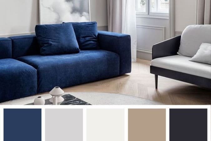
Blue, for example, links in human mind to sky and water. Neuroscience studies indicate
blue exposure lowers heart rate and reduces stress levels. Thus, it gets used widely in
bedrooms and spaces requiring mental calm.
Green represents balance. Biophilic design research confirms green as most eye-
comfortable color, lying in middle of color spectrum processed with least effort. Thus,
humans feel stability and reassurance in spaces with green shades.
Gray, despite neutrality, holds complex psychological impact. Light shades give calm and
organization feelings, while dark ones may create coldness or isolation if misused. Studies
show gray always needs warm balancing elements.
Cool colors slow time perception. Behavioral research reveals humans feel time passing
slower in cool-colored spaces, making them suitable for relaxation but inappropriate for
energy-requiring areas.
Lighting plays decisive role in cool colors’ effect. Cool light with cool color may create
rigidity sensation, while warm light with cool color creates comfortable psychological
balance. This interaction supported by visual perception studies.
Cool colors don’t necessarily mean emotional coldness. When used smartly, they create
clarity and depth feelings. Many luxury spaces rely on cool colors with natural materials to
achieve this balance.
Social studies indicate cool-colored spaces reduce visual noise, making them suitable for
high mental stress individuals. But they may create distance feeling for some without
human elements like lighting or fabrics.
Conscious cool color selection depends on understanding personality and lifestyle. Some
need this visual calm, while others require warmer colors for psychological balance.
Ultimately, cool colors aren’t neutral as they appear. They’re powerful psychological tools,
and when used consciously, transform into emotional support elements making homes
calm, balanced spaces—not cold or detached.