How the Wrong Color Can Mentally Exhaust You Without
Noticing?
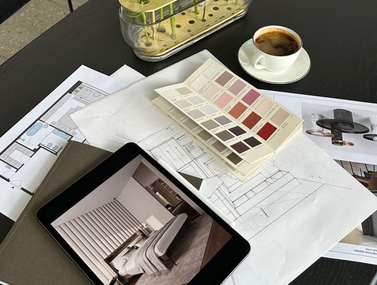
Color selection in homes often gets viewed as simple aesthetic decision, but it’s actually
complex psychological and cognitive choice. Environmental psychology research confirms
colors affect mood, focus levels, and even time perception within spaces. Thus, color
mistakes appear not just in appearance, but daily feelings inside the space.
One most common mistake is choosing color isolated from lighting. Color doesn’t exist
independently—it changes dramatically based on light source and intensity. Visual studies
show same color may read completely differently under natural versus artificial light,
creating visual shock post-implementation.
Second mistake relies solely on fashion. Trending colors look attractive in photos, but aren’t
always suitable for long-term living. Behavioral research indicates very bold colors cause
psychological fatigue over time, even if exciting initially.
Overusing single color ranks another common error. Brains need gradation and contrast for
comfort. Monochromatic spaces without visual breaks make minds lose depth perception,
creating unexplained boredom or tightness.
Ignoring space size proves impactful mistake. Dark colors in small areas may create
containment feeling if used consciously, but become visual burden if misused. Architectural
studies confirm color must always consider space dimensions.
Common mistake also forgets room function. Living room suitable colors aren’t necessarily
right for bedrooms. Color psychology explains each activity needs different color backdrop
for psychological support.
Not testing color before implementation repeats often. Small sample color doesn’t reflect full
wall reality. Applied studies thus recommend testing color from multiple angles under
different lighting.
Likewise, ignoring surrounding colors like floors and furniture leads to visual disharmony.
Brains process complete scenes, and any discordant element affects overall sensation.
Excessive strong contrast can prove exhausting. Contrast proves necessary, but overdoing
creates visual tension. Research shows medium contrast offers longest-term eye comfort.
Ultimately, biggest mistake treats color as isolated element. Color speaks integrated
psychological language, and when chosen consciously, becomes daily life supporter, not
obstacle.