Between Visual Neutrality and Subtle Psychological Impact
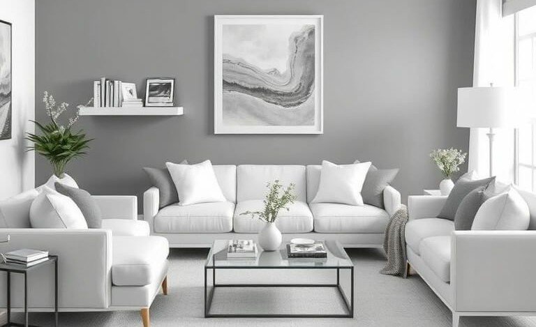
White and gray are among the most used colors in contemporary interior design, but their
popularity doesn’t mean they’re suitable for every situation. Environmental psychology
research indicates neutral colors affect spatial perception in more complex ways than we
imagine, working in the background to shape overall mood without direct attention.
White, for example, is collectively associated with cleanliness, simplicity, and purity.
However, modern studies show excessive use of pure white in living spaces may lead to
emotional emptiness or psychological coldness, especially in environments lacking natural
light or warm elements.
The human mind needs visual anchor points. When a space is entirely white without
gradations or varied textures, the brain loses ability to read depth and boundaries, creating
unconscious discomfort. Therefore, professional designs break white with natural materials
or warm shadows giving it human dimension.
Gray is psychologically complex. Studies indicate gray creates calm and order feelings, but
can become gloomy if too cool or used densely without balance. Light gray has completely
different impact than dark gray, with the latter enhancing enclosure or creating visual
pressure depending on lighting and space.
White and gray work best as foundations, not endings—as backgrounds allowing other
elements to express themselves. This approach derives from visual perception studies
confirming calm backdrops highlight details without eye fatigue.
Choosing white and gray should be conscious decision tied to room function, light quantity,
and daily usage nature, not mere trend-following.